Tracing the Evolution of Disney Trading Card Designs

Many collectors assume that Disney trading cards have always been about high-gloss finishes and complex holographic layers. That's a mistake. The history of these collectibles is actually a progression from simple, utilitarian cardboard to sophisticated, multi-textured art pieces. Understanding this evolution helps you identify why certain older sets feel different in your hands and why modern hits command such high prices.
We're looking at the shift in manufacturing, the change in artistic direction, and how the technology behind the cards has fundamentally altered what we consider "valuable." From the early days of basic trading cards to the high-end hits from brands like Topps or Upper Deck, the design language has changed completely.
How Did Early Disney Trading Cards Look?
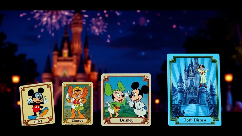
Early Disney trading cards focused on simple, flat imagery with minimal text and basic cardstock. In the mid-20th century, the goal was mass production and durability rather than visual complexity. These cards often featured hand-drawn illustrations that felt much more organic and "sketch-like" than the digital precision we see today.
If you find an old set in a thrift store, don't expect much in the way of special effects. There were no foil stamps or transparent windows. The charm was in the character art itself—often a single, iconic frame from a classic film. The borders were usually plain white or a single solid color. It's a stark contrast to the "maximalist" approach of the modern era.
The production methods were straightforward. Most cards were printed using traditional lithography or offset printing. This meant colors were often slightly muted or had a certain "grain" to them. It wasn't a flaw—it was just the tech of the time. If you want to see how these early styles compare to standard historical printing methods, Wikipedia's breakdown of lithography offers a great technical background.
Looking back, these cards feel like a different medium entirely. They aren't "premium" by modern standards, but they possess a tactile quality that digital-first designs lack. The thickness of the cardstock was often inconsistent, which is a big reason why many vintage pieces show wear. You'll notice that the edges aren't as perfectly rounded as a modern Topps Chrome card.
The Era of Basic Artistry
During this period, the "design" was essentially just the character art. There was very little graphic design happening on the card itself. You might see a small nameplate at the bottom, but that was it. It was a functional way to identify the character, nothing more.
This simplicity actually makes it easier to spot fakes or poorly preserved specimens. Because there's less to look at, any deviation in the printing quality stands out. It's a great way to start spotting authentic Disney trading cards because the simplicity of the era leaves very little room for error.
Why Did Card Designs Become More Complex?
The shift toward complex designs happened because collectors began demanding more than just a picture of Mickey Mouse. As the trading card market grew, manufacturers realized they could sell "hits"—special cards that were visually distinct from the base set. This led to the introduction of foil, holograms, and textured surfaces.
The drive for complexity was fueled by two things: technological advancement and the rise of the "chase" culture. Collectors wanted something that felt special. A standard card is fine, but a card with a gold-leaf border or a transparent window is a trophy. This changed the way designers approached the card layout. Instead of just a frame for a picture, the card became a canvas for layered effects.
Consider these three major shifts in design evolution:
- The Introduction of Parallel Sets: Designers started creating "versions" of the same card with different colored borders or patterns.
- Layered Textures: Moving from flat ink to embossed surfaces that you can actually feel with your thumb.
- Digital Illustration: The transition from hand-drawn art to high-resolution digital assets allowed for much more intricate backgrounds and lighting effects.
This transition changed the way we value a collection. A card isn't just a piece of art anymore; it's a piece of engineered engineering. The complexity adds a layer of perceived value that wasn't there in the 1960s or 70s. It's also why modern card protection is so important. A high-end textured card can actually be damaged by improper handling more easily than a flat cardboard card.
If you're worried about your newer, high-end cards, you should be looking into top-tier protection. Those textured surfaces are beautiful, but they can be sensitive to moisture and oils.
How Do Modern Disney Cards Differ from Vintage?
Modern Disney cards rely heavily on multi-layered digital printing and specialized coatings to create a sense of luxury. While vintage cards are defined by their simplicity and character art, modern cards are defined by their "finish" and rarity tiers. You're no longer just buying a picture; you're buying a piece of high-tech memorabilia.
The difference is most obvious when you look at the "hit" culture. In the 80s, a "hit" might just be a slightly rarer card in a box. Today, a hit could be a card with an actual piece of a costume embedded in it (relic cards) or a card that uses light-refracting technology to change colors. The design isn't just the art—it's the physical construction of the card itself.
| Feature | Vintage Era (Pre-1990) | Modern Era (2010-Present) |
|---|---|---|
| Primary Material | Standard Cardstock | High-Gloss, Chrome, or Textured PVC |
| Art Style | Hand-drawn/Analog | Digital/High-Resolution |
| Special Effects | Minimal/None | Holograms, Foil, Relics, Autographs |
| Design Focus | Character Illustration | Visual Texture and Rarity Tiers |
The complexity of modern cards also means the "base set" can sometimes feel a bit hollow. When every card is trying to be a masterpiece, the standard cards can feel a bit plain. This is a common complaint among long-time collectors. On the flip side, it makes the excitement of pulling a "big" card much more intense. The visual payoff is much higher.
It's also worth noting that the "art" has changed. Modern cards often use much more cinematic lighting and complex backgrounds. The characters look less like 2D drawings and more like 3D models. This is a direct result of the digital revolution in both animation and printing technology.
When you're evaluating a collection, you have to look at these two eras through different lenses. A vintage collection is about the history and the preservation of the original art. A modern collection is about the hunt for the most technologically impressive pieces. Both are valid, but they require different ways of thinking. For instance, knowing what separates ordinary cards from true collector's pieces is vital when you're dealing with these highly engineered modern sets.
The evolution of Disney trading cards is essentially a story of how we've moved from collecting pictures to collecting experiences. The design has moved from the page to the physical-digital hybrid. It's a fascinating look at how a brand as iconic as Disney keeps its physical products feeling fresh and exciting for a new generation of collectors.